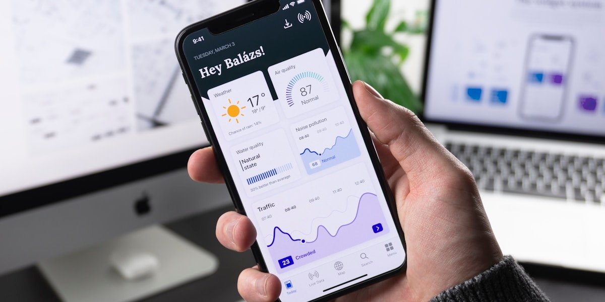
The digital landscape has undergone a seismic shift. Mobile devices now account for over seventy percent of global web traffic, and this percentage continues to climb steadily. For businesses and brands, this reality makes one thing abundantly clear: designing for mobile is no longer optional; it is the essential foundation upon which digital success must be built. At IPWEB, we have championed mobile-first design principles for years, and the results for our clients speak volumes. This comprehensive exploration explains why mobile-first thinking dominates modern web development and how your business can capitalize on this paradigm shift.
Mobile-first design is not simply about making websites work on smaller screens. It represents a fundamental rethinking of user experience, content hierarchy, and interaction patterns. When designers begin with mobile constraints and then scale up to larger screens, they create interfaces that are inherently more focused, efficient, and user-friendly across all devices. This approach produces websites that perform better in search rankings, convert visitors more effectively, and provide superior experiences for the majority of users who will encounter your brand through a smartphone.